Analysis of Digipaks and Instagram Posts
- Mar 11
- 3 min read
In this post, I'll be looking at some digipak covers and Instagram posts, in order to get a clearer idea of what I need to create for my minor tasks.
I was going to analyse some digipaks from Silent Planet and Spiritbox, since I really like their style and I want to create something similar, but I unfortunately don't own any of their official CDs, and I was unable to find pictures of them online, so I chose two CDs from my own collection to analyse.
The first one is Deep Shadows And Brilliant Highlights, by HIM:


This is, to this day, one of my favourite CDs that I own. I really enjoy the way the design and colour choice encompasses the atmosphere of the album, with its intricate and dark patterns; it gives you a clear and accurate idea of what the songs sound like just by looking at the CD case. I also really like how they added that pattern around the band's logo on the front cover; it makes the logo blend better, and makes the cover look overall more cohesive with the rest of the design. The art on the back and on the inside of the CD case really gets it across that this is a gothic metal band, with emphasis on the gothic side for this album specifically. The whole digipak cover just works to complement the band and their style, showcasing the vocalist on the front cover, which helps put a face to the band. This, along with the clothes he is wearing, gives you an idea of their music at a simple glance, which I think is very important. The font choice is really good too, for the album name and tracklist; it looks simple, yet elegant, which is very fitting.
For the second one, I chose Neon Strigoi by Bossferatu:


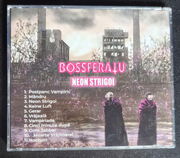


The front and back cover show the same picture, which is a variation of the album cover, but heavily edited and stylised to look more like a hand drawn image rather than a photograph. This makes the cover look infinitely more interesting and unique, rather than just having a picture of the artists on the cover. I also really like the way the colours are edited; the cover is almost entirely black and white, which really makes the purple colour of the band's signature neon purple glasses stand out, the same colour being used for the band logo (Bossferatu), the album name (Neon Strigoi), and the lighting on the cloaks. On the inside of the CD case we've got a booklet of the lyrics, which uses the same signature purple and includes some artwork of the band in the same hand drawn-ish style as the cover, which makes for a really cohesive and pleasant design, also enhancing the goth look of the CD case. The content of the cover in and of itself is a very good visual representation of the band, their lyrics and their sound, which is a blend of vampiric goth and modern sounding synth and postpunk; this is shown through the modern era LED glasses, combined with the cloaks, and also through the modern buildings in the background.
Lastly, I'm going to analyse Spiritbox's Instagram page:
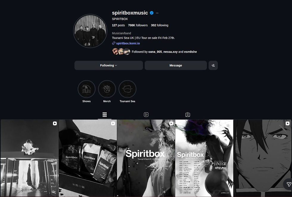
For their username, they've simply got the band's name with the word 'music' after it, and in the description they're listed as 'musician/band', two things that make it instantly clear what their content is about. Their profile picture and Highlight covers are all black and white, which is a stylistic choice that promotes their newest album, Tsunami Sea, the visual identity of which is based on the black and white colour scheme. Furthermore, we can see that all of their posts and reels since the release of this album are also black and white:


This creates a very unique and recognisable look for their content. Their posts and reels mostly consist of images or videos of the band members performing their music, or promotion posts for various tours, collaborations with other artists, etc. Their Instagram account is a very good way to keep updated with what the band is doing, and to receive some visual content that matches the atmosphere of their music.
During the process of creating my digipak cover and Instagram posts, I'd really like to focus on effectively conveying Silent Planet's visual identity, as well as the atmosphere of the album I'll be focusing on. It'll definitely be a fun challenge coming up with and creating a design that properly encompasses all of this and gives good insight into the band's style.


Comments