Preliminary Work - Vinyl cover
- Jan 21
- 3 min read
Updated: Jan 30
For my first preliminary task, I decided to try and create an album cover for the album Tsunami Sea by Spiritbox. They are a metalcore band from Canada, and their music is a surprising combination of heavy metal instrumental and hauntingly beautiful clean vocals, as well as classic metal vocals.
To get a better understanding of Spiritbox's visual identity, I decided to look at a couple of their album covers, specifically two of my favourite ones.


Lastly, I also looked at the original album cover of Tsunami Sea.

After studying these three album covers, I noticed that Spiritbox's style tends to be very abstract and rather unclear, and that each cover is built around one colour. This is a perfect visual representation of their sound, which is oftentimes a unanimous blend of instrumentals and vocals where it's difficult, at times, to distinguish which sound is which. Each album sounds exactly like what its cover and name suggest: Eternal Blue has a sound that makes you think of clear blue waters and rolling waves, The Fear of Fear sounds like a hazy, purple mist, and Tsunami Sea like merciless waves of dark water breaking on unmoving stones. And that is exactly the atmosphere I want my own album cover to portray.
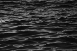
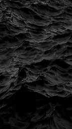
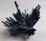
So, I started by looking for some pictures which I think incorporate the visuals and the vibes I'm going for. Here are the photos I chose:


Next, I copied all the images into Inkscape, a design and illustration program I've briefly used before, thought I wasn't too familiar with it and all its features. I didn't have a very clear idea of how I wanted the album cover to look in the end, but I knew I wanted it to be a sort of collage that included elements and textures from all the pictures I had chosen, and I also wanted it to be black and white, because I thought that would be very cohesive with the overall atmosphere of the album. Below are some screenshots of the process:

First, I layered the image of the crystal with the side profile of the woman, then clipped one from the other, and added the picture of the crystal back underneath the side profile:

I then added the result on top of the image of the foamy waves:

It felt a little too plain, so I cropped one of the pictures of waves and made it into a frame, which I then added to the album cover:

I tried incorporating the rock texture and the crystal in the corners of the cover but I ended up not keeping that change because I felt like it looked too busy:

Instead, I cropped a rectangle from the image of the rock texture, which I then added some text on top of; I had a pretty clear idea of which font I wanted to use (Cinzel), and after testing it out, I decided it fits, so I stuck with it:


And lastly, here is the finished album cover:

I also decided to make the back of the vinyl cover, where all the tracks are listed. Unfortunately I forgot to take screenshots of the process, but I mostly just used the already existing front cover anyway.

Overall, I'm pretty proud with how the vinyl cover turned out. It wasn't a very linear process, and it was definitely a challenge since I had close to no experience in visual design; it also took some getting used to the program and learning some new features, but I'm pleased with the result. Not to mention that having made this, it will be a lot easier to make the digipak cover, since I'll already be familiar with the software and the process of creating something like this.


Comments